Creative, Win More Clients – 14 Proven Ways
If you can’t win clients, you don’t have a business. End of story.
Once a prospect inquires, how do you show them that you are the answer? How do you differentiate from the five other creatives they reached out to?
I want to help you stand out in a sea of competition.
Over the years, having the opportunity to work with hundreds of brands and learning about what works and what doesn’t, I felt compelled to pass on what I’ve learned.
This article is about helping you bypass the mistakes I made, so your creative business can grow faster and more efficiently.
I will show you very specific, proven ways to win more creative clients that you can implement right now.
Enough talk. Let’s take a look at what works.
1. Earn their trust…quickly.
One of the easiest ways to win that potential client is to show that you are trustworthy.
Establishing trust is the cornerstone of winning their business.
But what does this even look like? How do you establish trust with someone you are talking to for the first time?
Here’s the secret sauce:
Quickly get the focus on them and their business.
Show them you genuinely want to get to know what they are looking to accomplish.

Get to know their story, goals, audience, preferences, competitors, etc.
In short, ask applicable, highly relevant questions about them and their business.
That all-important first impression you always hear about? It’s a real thing.
Trust is at the root of a lasting (positive) first impression.
So put all the attention on them from the very beginning.
They will trust you more and you’ll win more clients as a result.
2. Keep your contact form limited.
It’s seems like such a small thing.
Who cares about limiting fields on your contact form?
Apparently, it matters (big time).
After analyzing over 40,000 of their customers landing pages, Hubspot’s Dan Zarrella found that decreasing field count from 4 fields to 3 increased conversion rates by almost 50%.
That means you just added 50% more revenue from this one simple change.
Looking for a user-friendly contact form solution? Typeform and Gravity Forms are great places to start.
3. Get them on the phone.
Don’t underestimate the value of a good, old-fashioned phone call.
Hopping on a call with your potential client is an easy way to quickly earn a prospect’s trust.

Way too much time passed before I asked the obvious question:
‘Which communication avenue converts the best, phone or email?’
So I began testing both.
Can you take a guess at the results?
When I responded via email to a client project, nearly 21% converted to a paying customer. But, when I was able to speak with my client over the phone, 65% turned into paying customers.
That’s a 309% increase just by jumping on a phone call!
This alone could be quite the game-changer for your creative business.
Note: You can set-up scheduling integration with helpful software like Calendly where potential clients can schedule a phone call based on your preset availability.
4. The perfect testimonial.
It’s nothing new that you should have testimonials or reviews somehow connected to your creative business.
But what does the perfect testimonial look like?
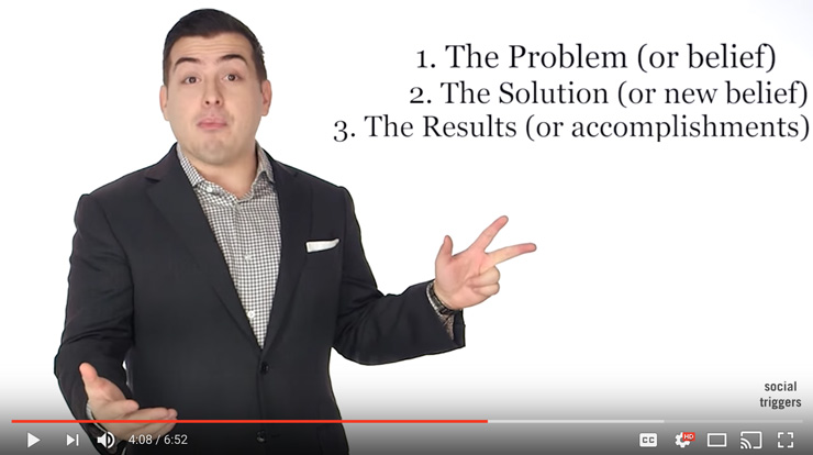
Derek Halpern, Founder of the popular Social Triggers blog, claims to have unlocked the code to “The Perfect Testimonial“.
Here’s the structure:
- The problem (or belief)
- The solution (new belief)
- The results (or accomplishments)
As creatives, we have a primary job to do:
Discover the problem and create the solution.
When your testimonials run in step with your creative solution, potential clients notice. They will have the peace of mind to hire you.
Why?
They have specific evidence of you coming through in the past.
When you reach out to your clients for those testimonials/reviews, timing is everything.
This is where the power of reciprocity comes in.
For example, let’s say you’re working on a logo design project. The client is ecstatic about finalized logo and you send the necessary files.
Here’s the opportunity.
You just gave them brand new, shiny versions of their logos. You gave them something valuable. In turn, they will be more inclined to reciprocate with a testimonial.
Here is a sample of what your email might look like:
Dear {client first name here},
Here are your final logo design files!
The attached png/jpg files will work well for your own use and can be used for web/social media/directory listings. The vector, ai file you won’t be able to open, but you will need it down the road as many printing providers request the vector art. This vector file is scalable to any size while still maintaining it’s high quality, sharp nature.
As a side note, would you be willing to write a short testimonial about your experience with {your company name here}? Your voice to potential clients is important to me and I would love to hear your thoughts.
Your possible review is very much appreciated!
Thank you,
{your first name here}
See how the above email is a light, non-invasive way to ask for something? I’ve never had someone say ‘no’ to the above email. Feel free to use it as you see fit!
If you are feeling good, add the following to your email:
If it’s helpful, here’s a testimonial structure that has proved effective:
- The problem (or belief)
- The solution (new belief)
- The results (or accomplishments)
The above structure may even help them keep their thoughts organized, making the review even easier to write.
It’s worth it to note: If you had bad communication throughout the project, didn’t hit turnaround times and/or produced unsatisfactory creative work, then everything mentioned above just won’t work.
So…compile and display your new list of perfect testimonials.
Don’t wait!
Start now and you’ll thank yourself later.
5. Tell your story, flaws and all.
Kissmetrics takes the cake with an in-depth article on how to tell your story.
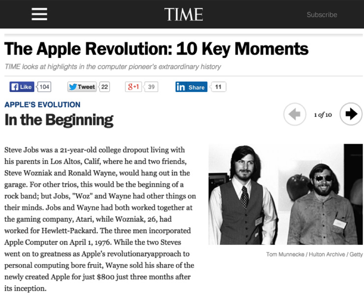
Wherever you’re at in your creative career, show your entire journey. Bumps, bruises and all.
You know the saying, “Fake it till you make it”?
Think of the exact opposite.
People are savvy to those who put up a front.
Our failures have a way of making us stronger, which makes your story even more authentic and powerful.
The great Thomas Edison said it best:
“I have not failed. I’ve just found 10,000 ways that won’t work.”
Showing your failures, scars and flaws is refreshing to most people.
I realize this can sound pretty counter-intuitive.
Why does it resonate? Why do most people see your trials as something that’s…refreshing?
Every single person can relate.
Everyone has gone through (or is going through) something difficult in their life.
To remove every bump and bruise from your story will actually take away from the full impact your story could make.
Very simply, be who you really are.
You’ll not only win a lot more clients, but win more clients who can empathize with you or even share a similar story.
Show your whole story. Don’t hold back.
6. Website conversion factors
For most creatives, we can often forget about the purpose our website serves.
Turning visitors into customers.
The idea of conversion-centered design can be a foreign concept.
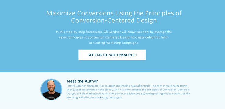
Let’s take a closer look at how you can increase your website’s conversion rates to win more clients.
In Google’s eyes, website page speed has grown to be one of Google’s 200 ranking factors for SEO (search engine optimization).
Admittedly, I need to work on this for my own site.
When someone hops on your site and leaves without visiting any other pages, this is called a “bounce”.
Kissmetrics conducted a case study where 50% of visitors bounced from the site after waiting 3 seconds or more for a page to load on their desktop computer.
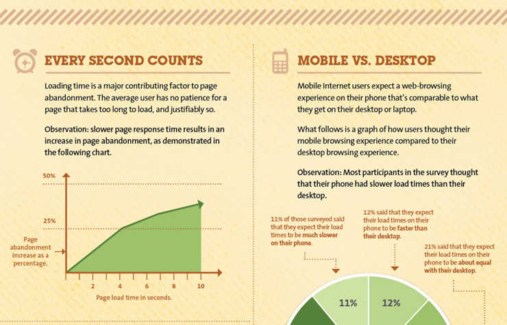
You just lost half your potential client base just because your web page is loading slow.
If you can, try to get your (desktop) page speed closer to that 2-3 second mark.
GT Metrix and Pingdom are the best free tools to see just how fast your website is loading. GT Metrix will even give you tips on how to optimize your site so it performs more effectively.
7. Website portfolio
When it comes down to it, we are all very visual learners.
The brain processes visual information 60,000 times faster than it takes for the brain to decode text.
Enter your creative portfolio.
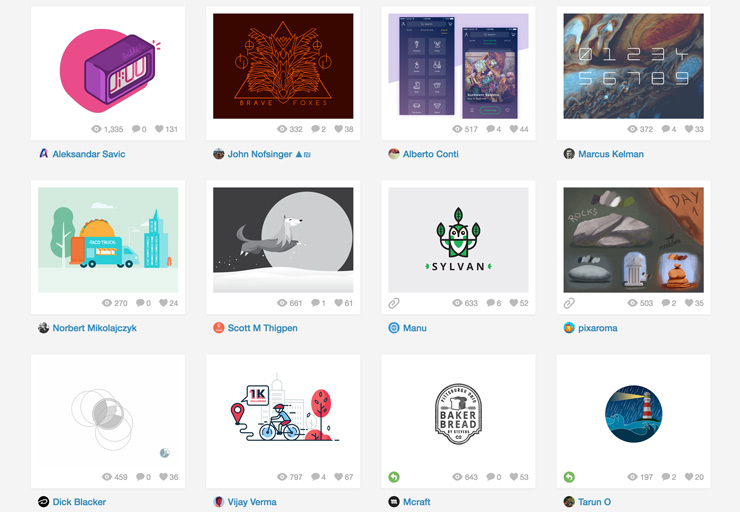
Does your portfolio show your very best work? Does it show your versatility? Does it start and end with key pieces?
Earlier, we talked about developing trust…
Your portfolio conveys trustworthiness in a big way.
Potential clients are looking for the care, quality and innovation you put into your work. They will compare other creative portfolios (aka your direct competition)…and make a choice.
I always will remember Professor Mazellan’s wise words from design school,
“You are only as good as the weakest piece in your portfolio.”
Such wisdom there.
Don’t be afraid to limit your portfolio to a few of your very best pieces.
If you have 30 designs and 8 are above the rest, then 8 it is.
Quality over quantity wins the day.
8. The beauty of the follow-up.
Can resonate with the following example?
You hop on a call with a potential client and it couldn’t have gone better.
You wait to hear back the official, ‘Yes, let’s move forward.’
You wait some more…
Before you know it, 1 week…2 weeks…a month has gone by.
No response.

Here’s where the follow-up comes in.
After your initial convo, wait about 2-3 days to check in.
I’ve found that when it comes to following-up, email actually works best over a call.
Reason being, they may still be in the middle of the decision making process, or, they simply haven’t given the project a ton of thought–an email, in this case, is a bit less pushy.
When you do follow-up, don’t just say, “Would you like to move forward with your project?”.
There’s time for that.
Instead, send examples of your best work in alignment with the creative items they need. Send references, testimonials, bulleted benefits, a direct link to your creative portfolio, etc.
Here’s an example of an email you can use that’s helped me win more clients:
Hi {client’s first name},
Thanks for hopping on a call the other day!
I just wanted to follow-up with you and give you client references / testimonials for your reference.
1. References (Each gave permission to be contacted)
Client: {full name}
Company: {company name}
Email: {email}
Phone: {phone number}
2. Testimonials
“Testimonial #1 here…” – {client’s full name, position and company name}
“Testimonial #2 here…” – {client’s full name, position and company name}
“Testimonial #3 here…” – {client’s full name, position and company name}
Please let me know if you have any questions!
I’m excited for the opportunity to work with you and help take your brand to the next level.
Thanks,
{your name}
So…don’t forget to follow-up with your clients (without being too pushy).
Many times, people are just busy just need the extra reminder to give their project a gentle nudge.
9. Build (genuine) relationships with influencers.
This one point has impacted my design business in such an impactful way–and I want the same for you.
I’ve got a short story for you to help illustrate this point.
A couple years ago, I reached out to Jacob Cass who runs the popular design blog Just Creative.
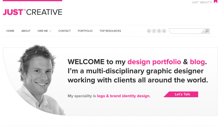
I followed his blog closely and one day decided to reach out and ask for his thoughts on my 20,000+ word guide to logo design.
He had a refreshingly quick response.
In his reply, he mentioned that he read the entire logo guide and thought that I should turn the logo guide into an eBook or printed book.
Turning this into a book wasn’t even on my radar.
Later, he gave a powerful quote about the guide saying:
“The Ultimate Guide to Logo Design is the most complete, timeless resource I have read on logo design to date. Kyle’s writing style is actionable, easy to read and has a conversational tone that outlines the keys to success based on his own experience working with hundreds of brands, big and small.”
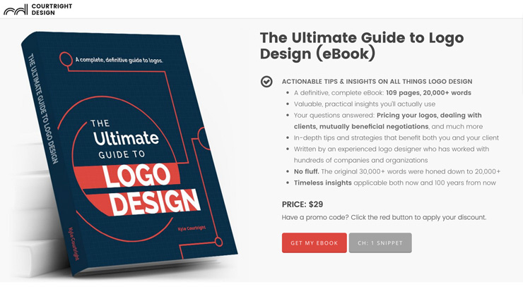
After taking his advice and going the eBook route, The Ultimate Guide to Logo Design has now been purchased by designers from 43 countries representing 6 continents.
All of that from one small, seemingly insignificant email asking for his thoughts.
Now, Jacob and I keep in touch on a regular basis and I consider him a good friend.
I’m grateful for his willingness to continue advocating for the logo guide, featuring it here and here on his blog.
So, the question begs…
Who are the influencers you respect? Creative mentors you admire?
Don’t be afraid to reach out and get a genuine conversation going.
You have nothing to lose and a lot to gain.
Maybe you get a feature on their website. Maybe you land a guest post on their blog. Maybe you offer creative work in exchange for a link back to your creative portfolio.
Whatever it may be, you can win a client over (or at least “tip the scales” in your favor) when an influencer features you in some way.
Your credibility skyrockets and real value is added to what you offer.
10. Don’t be afraid to be transparent.
Be transparent with your potential clients from the very beginning.
As an example, I always let my potential clients know:
I’m not the cheapest designer out there, but if you’re looking for a designer who strives for excellence in producing an aligned solution with your brand, then it’s a good fit.
Being up front with prospects in this way says two things:
I. A higher level of trust is developed. (I’m not the cheapest designer out there…)
II. The investment is worthwhile. (…producing an aligned solution with your brand…)
So don’t be afraid to be transparent and you will reap the benefits.
11. Ask this simple question.
Working with hundreds of brands along the way, I’ve never met a company or organization who wasn’t on a budget.
So, let’s speak their language.
This simple question will help you win more clients than you can even handle. Seriously.

Here it is:
How does my price align with your budget?
Mention this soon after you give them your price point and you will open up yourself to a lot more avenues to win the client.
But what makes it so special?
Depending on their answer, their are 3 scenarios their answer can fall into.
Scenario #1: On budget
You’re on budget. Perfect. Done.
Scenario #2: Near budget
If their budget is close, you can move toward a mutually beneficial agreement.
Remember: Know exactly what your services are worth and how much this particular project is worth to you.
That said, their are occasions where negotiating down on price can be mutually beneficial.
You can give a small discount now, in exchange for future ongoing work down the road. For instance, knocking off $50 now, for future ongoing work at $300/month may be worth it to you.
Hopefully this goes without saying, but make sure you get everything down in a written contract.
Let’s look at more of a specific example…
Say your potential client needs a logo. Your logo design fee is $1k (flat) and their budget is $750. You are willing to come down to $750 for the logo, if down the road they agree to use you for their $5k website. If they agree, (again, make sure everything is in writing) all of the sudden, you just earned $4,750 because of your openness for the benefit down the road.
Instead of completely losing the client, you exchange initial value for greater future value.
Scenario #3: Far from budget
You’ll quickly be able to recognize if they are way out in left field when it comes to price.
Again, for the sake of the example your logo price is $1k. They say their budget for you to work on their logo is a firm $100. Yikes. You could try to explain to them the time and effort that goes into creating a good, quality logo…that you charge a price that aligns with the value you provide. With their budget and your price point being so far apart, the effort is usually pretty futile. This is about the time when you wish them well and send them off.
The gap is way too big to think about a negotiation that will realistically benefit both parties.
12. Payment is a touchy subject.
Money can be such a touchy thing.
When it comes winning the client, you have to get this right.
Being too overly excited, talking too fast, being too casual, lacking confidence in your tone of voice–these are all factors that can make your prospects put their guard up.
It can even mean that you lose the project altogether.
As an example, let’s say you send your potential client payment details to send a check payment.
Tell me which sounds better to you:
“I need payment from you ASAP.”
Or,
“When you have a chance, please send the down payment and I’ll be sure to let you know when it arrives safely.”
The second option wins every time because it’s not pushy or impatient.
If you’re on the phone or in a meeting with a prospect, just slow down.
Gather yourself and deliver your price point when the moment comes.

Show them that the price you just proposed is exactly what you’re worth.
Show that you’re a valuable asset to what they are looking to accomplish.
And don’t be afraid to let them know that you’re excited for the opportunity to work with them.
Clients love to hear this. Try not to go overboard, though. It can turn into something that seems a bit fake or not as genuine.
All in all, these small subtleties can help tip the scales in your favor.
Apply these principles today. You’ll win more clients tomorrow.
13. Ask impressive, in-depth questions.
Asking well-thought questions not only shows that you’re listening, but shows them that you genuinely care about their business and brand.
It says that you aren’t the type of guy/gal who is just trying to make the quick sale.
When you really delve deep and truly listen, you’ll ask the types of questions that they haven’t even thought of yet.
This speaks volumes to the client.
I recently talked to a startup business owner of a soap company.
I asked him, “What makes you different from all the other soap companies out there?”
There was a long pause and said, “I actually don’t know”.
Within a few minutes, I began asking him in-depth questions about his goals, how he differentiates from competitors, what’s his purpose starting this business, etc.

This is the awesome value we can provide as creatives.
When you can help the client realize that you offer way more than just creative, then your value increases like you wouldn’t believe.
14. Commoditizing what you we do.
What does it even mean to commoditize something?
Synonyms include: Spec work. Design contests. 99designs.
It’s more officially defined as:
“…a process in which goods or services become relatively indistinguishable from competing offerings over time.” (source)
In other words, the value or worth of what you offer is diminished merely to price.
Never a good thing.
If you want a blueprint for pricing what you’re worth, David Airey’s timeless pricing formula is the best I’ve seen:
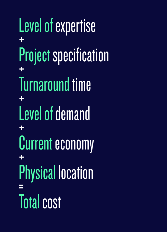
Use this pricing formula to reevaluate the worth of your creative services.
When you add value, update your rate in direct alignment with that value.
For the love of everything that is good…please don’t miss this:
Each creative has a responsibility to the next creative.
If you offer a logo for $5, what does that say about the value you place on your logo design work?
Quite literally, you’re saying that I feel my logos are worth $5.
Don’t do this to yourself, your fellow creatives, or the creative industry.
Me. You. We…are responsible.
Each creative can either positively or negatively impact what our design services are worth to the consumer.
We know the impact effective visual communications can make on any type of entity.
Let’s value what we do, so our clients can do the same.
What are some of the specific ways you win more clients?
[This post has originally appeared on Kyle’s blog. We highly recommend following him.]

Kyle Courtright is a designer, author & entrepreneur sharing helpful #logodesign & branding content for passionate creatives
Super!
Good stuff is on the way.
Oops! Something went wrong while submitting the form :(


